Optimizing the Trading Terminal: Building the Ultimate Modular Workspace

June 19, 2026
By Hyperdash
For high-frequency perpetuals traders, a custom trading dashboard reduces cognitive friction and execution latency.
Published
June 19, 2026
Author
Hyperdash
Reading time
9 min read
Category
Tools & Data
Traditional trading interfaces force users into rigid layouts, increasing cognitive load and execution latency. A custom trading dashboard allows perpetuals traders to isolate critical data points like liquidation heatmaps and order flow, reducing time-to-execution.
Traditional trading interfaces force users into rigid layouts, increasing cognitive load and execution latency. A custom trading dashboard allows perpetuals traders to isolate critical data points like liquidation heatmaps and order flow, reducing time-to-execution.
The “screen real estate” problem in modern trading is acute. The average retail trader is overwhelmed by a barrage of flashing numbers, redundant charts, and poorly placed order entry forms. This is why one-size-fits-all terminals fail high-frequency traders. They force the user to adapt to the interface, rather than the interface adapting to the user’s strategy. When you are managing positions in fast-moving markets, searching for a specific data point across a cluttered screen is not just an inconvenience, it is a measurable cost in slippage.
Understanding what is a trading terminal and why it matters is the first step toward better execution. Legacy systems, often modeled after the ubiquitous Bloomberg Terminal, were built for an era of manual phone orders and slower market structures. Today, the solution is a modular workspace. A modular workspace allows you to strip away the noise and focus exclusively on the metrics that drive your edge.
Configuring the Hyperdash Modular Dashboard
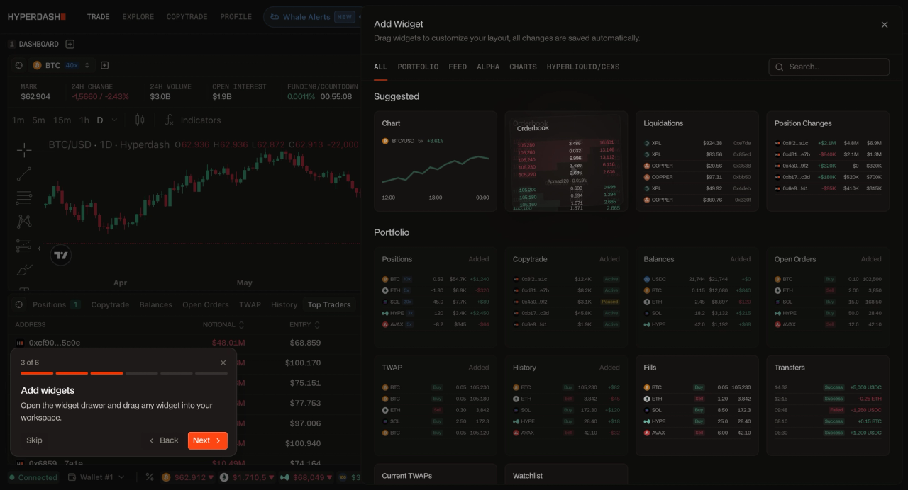
The Hyperdash modular dashboard enables traders to build a custom trading terminal using drag-and-drop widgets. By integrating the Cmd+K Command Palette, traders can execute orders and switch asset layouts entirely via keyboard shortcuts, eliminating the latency of mouse-based navigation and reducing time-to-execution on every trade.
The Hyperdash modular dashboard enables traders to build a custom trading terminal using drag-and-drop widgets. By integrating the Cmd+K Command Palette, traders can execute orders and switch asset layouts entirely via keyboard shortcuts.
Setting up the Hyperdash dashboard is intuitive. Instead of fixed panels, the interface is composed of independent, draggable widgets. You can place the orderbook depth widget exactly where your eyes naturally track, or position your open positions panel adjacent to the order entry form. This level of customization ranks among the best analytics and trading tools available for on-chain traders.
The Widget Breakdown: What Each Module Actually Does
Effective perps trading terminals utilize specialized layouts based on strategy. Scalpers prioritize order book depth and tick charts, while swing traders focus on cohort analysis and macro funding rates. A one-size-fits-all dashboard is not a dashboard, it is a compromise. The traders who consistently outperform build workspaces that match their decision-making process, not the platform's default layout.
Most traders add widgets to their dashboard because they look useful. The ones who outperform add them because they understand exactly what signal each one carries and what decision it should trigger. Here is what each core Hyperdash widget is actually telling you.
PnL Cohorts
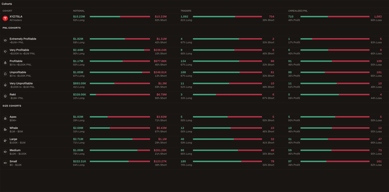
This is one of the most underused data layers in on-chain trading. The PnL Cohorts widget segments the market’s open positions by profitability, showing you what the most profitable wallets are currently holding versus what the losing cohort is positioned in.
The insight is structural: when the profitable cohort is heavily short and the losing cohort is heavily long, you have a high-conviction directional read that goes beyond price action alone. Think of it as a real-time sentiment survey, but weighted by actual trading performance rather than opinion.
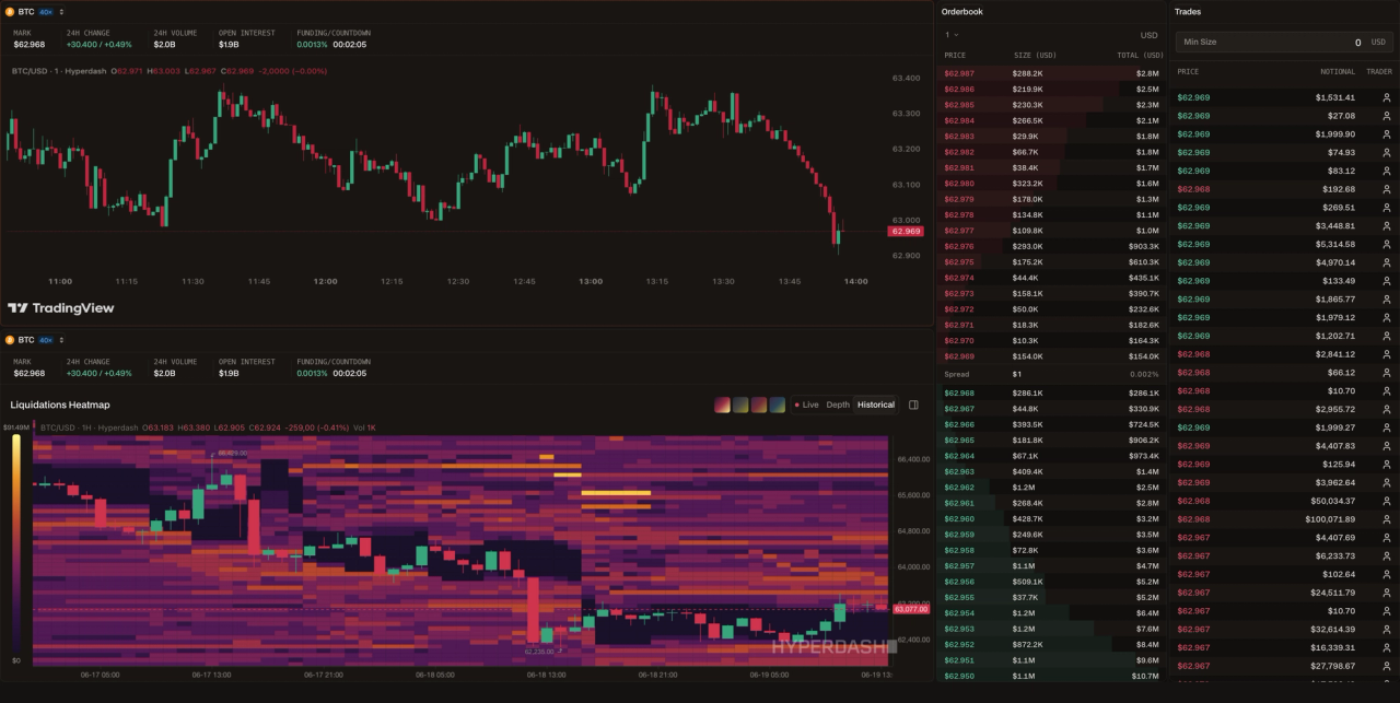
Liquidation Heatmap
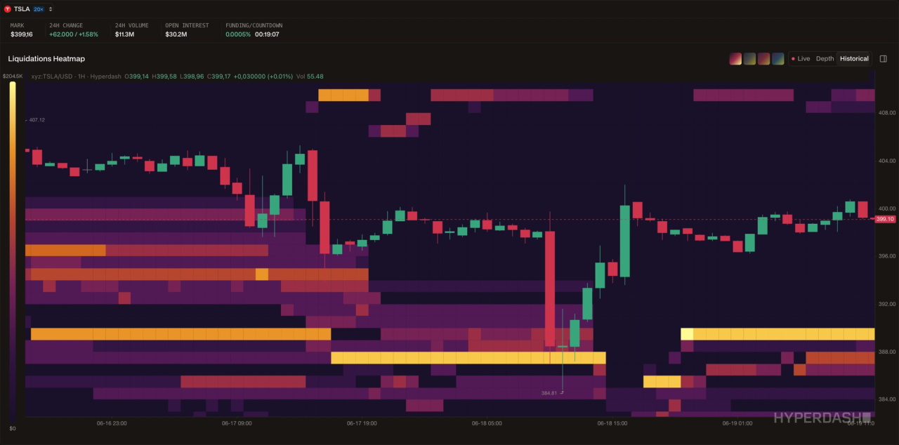
The liquidation heatmap widget visualizes where leveraged positions will be forcibly closed if price reaches certain levels. These clusters are not just risk indicators, they are magnets. Markets frequently move toward areas of dense liquidations because clearing those positions generates momentum and volume.
A scalper uses the heatmap to identify the nearest high-density liquidation cluster and positions accordingly. A swing trader uses it to avoid placing stop losses at the same price levels where thousands of other traders have theirs.
Orderbook Depth
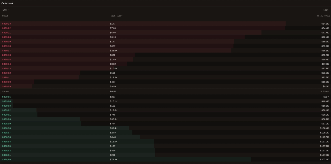
The orderbook depth widget shows the stacked buy and sell orders at every price level. Large bid walls signal institutional support and can act as short-term floors. Large ask walls signal resistance.
But the more important skill is reading what is not there: thin orderbook depth on one side means a small amount of volume can move price significantly, which is critical information for both entry sizing and stop placement.
Historical Funding Rate
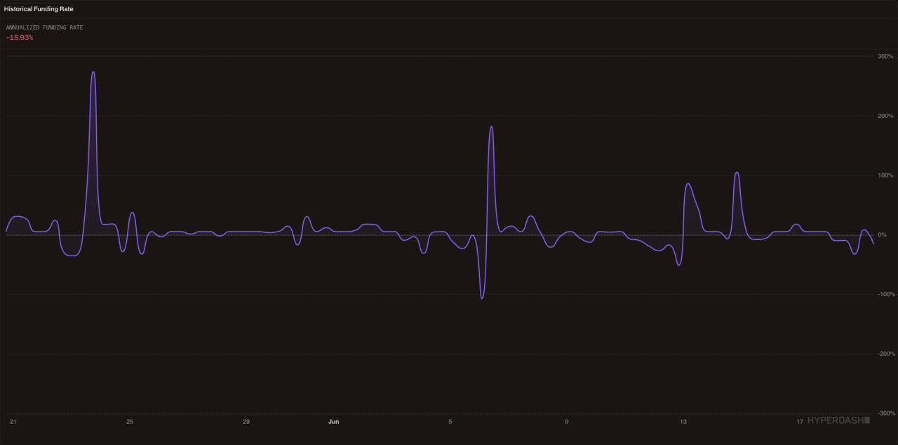
The funding rate is the mechanism that keeps perpetual prices anchored to spot. When the rate is positive, longs pay shorts, meaning the market is in a speculative, bullish state. When it is negative, shorts pay longs.
The countdown widget tells you exactly how many minutes until the next funding settlement. For a scalper, this is irrelevant. For a swing trader holding a position overnight, knowing whether you are about to receive or pay funding, and at what rate, is a direct input into your position sizing decision.
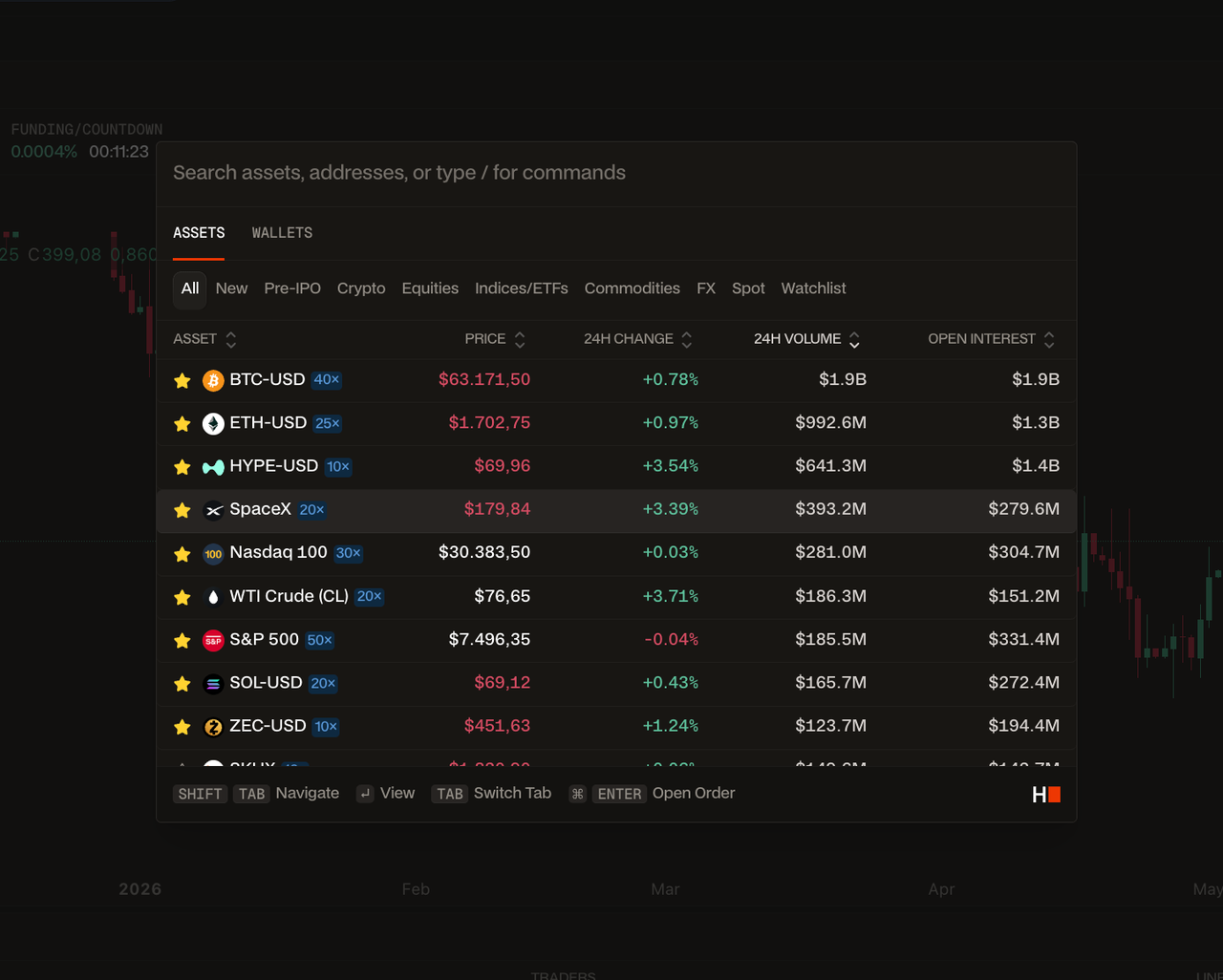
A critical feature tying all of this together is the Cmd+K Command Palette. As noted by the Nielsen Norman Group, keyboard shortcuts significantly enhance UX efficiency for expert users.
The Cmd+K palette allows you to navigate the platform, switch assets without ever touching your mouse. In a fast-moving market, the difference between a keyboard first workflow and a mouse-dependent one is not a matter of preference, it is measurable execution latency.
Workspace Templates for Different Strategies
Effective perps trading terminals utilize specialized layouts based on strategy. Scalpers prioritize order book depth and tick charts, while swing traders focus on cohort analysis and macro funding rates. A one-size-fits-all dashboard is not a dashboard, it is a compromise. The traders who consistently outperform build workspaces that match their decision-making process, not the platform’s default layout.
Understanding the nuances of scalping vs swing trading layouts is the prerequisite for building a terminal that actually supports your edge, not just one that looks busy. Below are three battle-tested workspace configurations. Each one is built around a specific objective, a specific set of widgets, and a specific decision-making workflow. They are starting points, not prescriptions, the goal is to give you a mental model for how to think about layout design, so you can adapt it to your own style.
Template 1: The Order Flow Scalper
- Objective: Capture short-duration moves (seconds to minutes) by reading real-time liquidity and order flow before price reacts.
- Primary assets: BTC perp, ETH perp, high-volume perps. A dedicated BTC trading terminal layout is the natural home for this template.
Dashboard configuration:
- Orderbook Depth — This is your primary instrument. You are reading bid/ask imbalances and watching for walls to appear or disappear in real time.
- Trades — sidebar, always visible. Large orders hitting the book before price moves is the signal you are waiting for.
- Liquidation Heatmap — secondary panel. Identifies the nearest high-density cluster. Your scalp target is often just above or below it.
- Chart — small, 1-minute or tick. You are not trading the chart. You are using it to confirm momentum direction only.
- Funding Rate Countdown — header bar. Ignore it for most scalps, but be aware of the 8- hour settlement window, volume often spikes in the minutes before funding.
What you are NOT putting here: PnL Cohorts, macro charts, multiple timeframes, technical indicators. Every additional widget is cognitive load you cannot afford when you have a 30- second window to execute.
Decision workflow: Whale Alert fires on BTC → check orderbook for corresponding bid wall → confirm 1-minute momentum → enter with tight stop just below the wall → exit when price reaches nearest liquidation cluster or wall disappears.
Template 2: The Macro Hedger
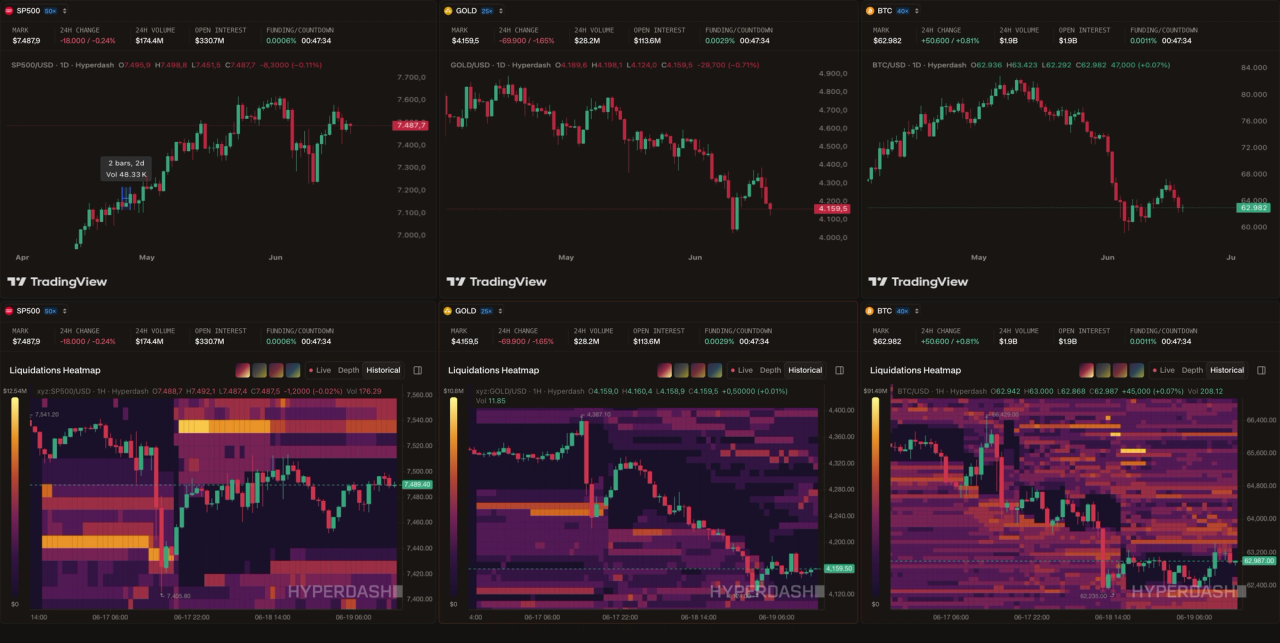
- Objective: Manage multi-day or multi-week positions across traditional and crypto assets, using perpetuals to hedge spot exposure and generate yield on the hedge via funding rates.
- Primary assets: S&P 500 perp, Gold perp, BTC perp. This template is built for traders who hold real-world exposure and use on-chain perps to protect it.
Dashboard configuration:
- Multi-asset chart panel — three charts side by side, all on daily or 4-hour timeframes. You want to see correlations and divergences across your hedged assets simultaneously.
- Funding Rate — You are holding positions for days, which means funding is a real cost or income line. A positive funding rate on your short hedge means you are being paid to hold it, that changes your sizing calculus.
- PnL Cohorts — central panel. The most profitable wallets’ positioning is your macro sentiment indicator. If they are net short while you are long spot, you have confirmation. If they are flipping long while you are holding a short hedge, that is a signal to reassess.
- Open Interest — You are watching for OI to diverge from price. Rising price with falling OI on your hedged asset means the move is not being backed by new conviction, your hedge may be premature or your target may be closer than expected.
- Liquidation Heatmap — secondary reference. Useful for identifying where a macro move might stall or accelerate.
What you are NOT putting here: orderbook, real-time trade feeds, scalping tools. If you are using perpetuals to monitor your hedge positions over a multi-day horizon, intraday noise is your enemy.
Decision workflow: Check PnL Cohort positioning each morning → review funding rate trend over past 24 hours → assess whether hedge is generating positive carry or costing you → adjust size if OI diverges from price direction → save updated layout as a named template for each asset you are hedging.
Template 3: The Copytrader
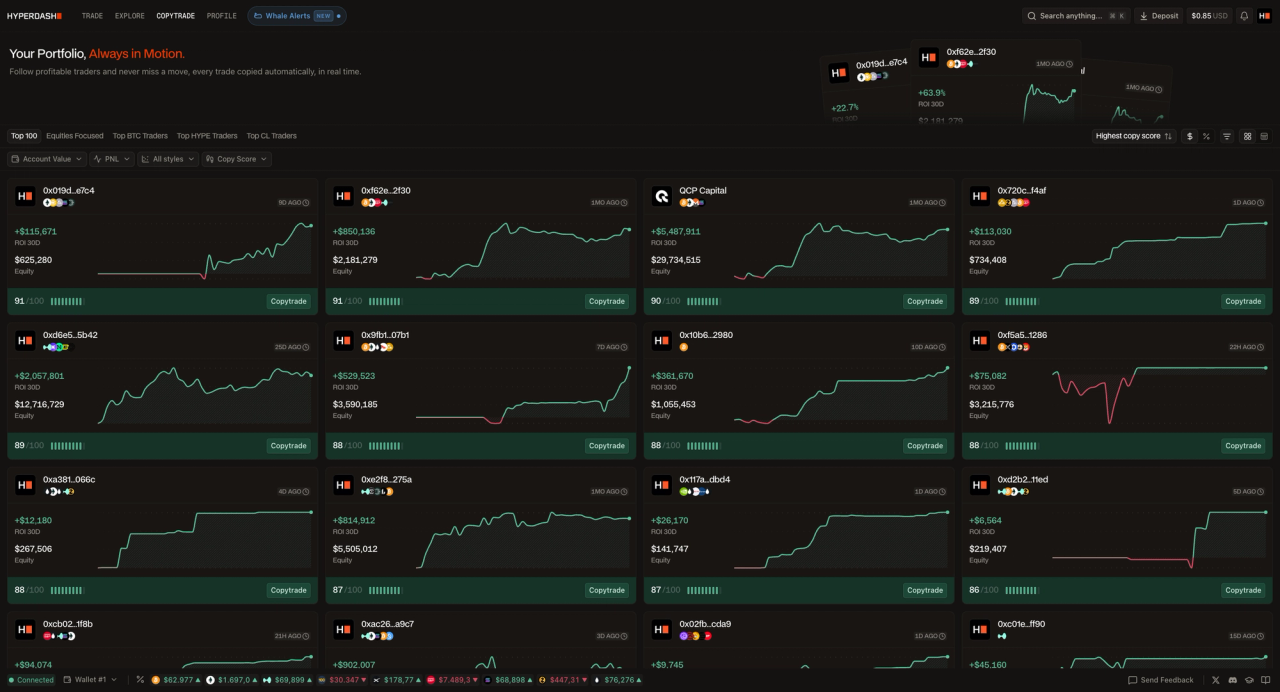
- Objective: Mirror the perpetuals strategies of verified high-performing traders while maintaining enough visibility to understand what you are copying and why.
- Primary assets: Varies by followed trader. Filter by Top BTC, Top HYPE, or Top CL Traders depending on your preferred exposure.
Dashboard configuration:
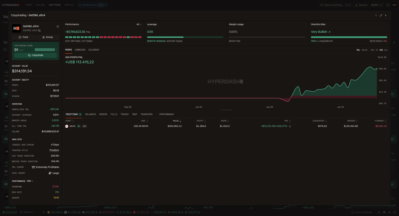
- Copytrade leaderboard — primary panel. Sorted by copy score and 30D ROI. You are not just looking at returns, you are looking at consistency, drawdown depth, and equity size.
- Followed trader PnL feed — live panel showing the real-time positions of traders you are copying. This is where you monitor whether the strategy you are mirroring is behaving as expected.
- Funding Rate — always visible. Even when copytrading, you are still paying or receiving funding on every position. Understanding the aggregate funding cost of your copied portfolio is essential for accurate performance attribution.
- Open Interest on primary asset — sidebar. If your copied trader is heavily long BTC and OI is falling, that is a context flag worth noting.
What you are NOT putting here: Orderbook depth, whale alerts, scalping tools. A copytrading dashboard setup is a monitoring and oversight workspace, not an execution workspace. The less you intervene, the better the strategy performs.
Decision workflow: Review leaderboard weekly for copy score changes → monitor followed trader PnL daily for unexpected drawdowns → check funding rate impact on overall portfolio return → adjust followed traders if strategy drift is detected.
Once you have configured any of these layouts, save it to your profile as a named template. The Hyperliquid infrastructure powering Hyperdash, detailed in the Hyperliquid App Documentation ensures your layout loads instantly regardless of market conditions or device. With minimum margin requirements verified at less than $1, there is no cost to building and testing multiple workspace configurations before committing to one.
Frequently Asked Questions (FAQ)
What is a custom trading dashboard?
A custom trading dashboard is a modular interface that allows traders to arrange charts, order books, and data widgets according to their specific strategy, rather than using a fixed layout.
Why is keyboard navigation important in a perps trading terminal?
Keyboard navigation, such as a Cmd+K command palette, drastically reduces the time it takes to switch assets or execute trades compared to mouse-based clicking, minimizing slippage.
Can I save multiple dashboard layouts on Hyperdash?
Yes, the Hyperdash modular dashboard allows users to create and save multiple workspace templates tailored for different market conditions or trading styles.
Disclaimer: This article is for informational and educational purposes only and does not constitute financial advice, investment advice, or a recommendation to buy or sell any financial instrument. Perpetual futures and other derivatives involve significant risk, including the potential loss of your entire invested capital. Leverage amplifies both gains and losses. Always conduct your own research and consult a qualified financial advisor before making any trading or investment decisions. Past performance is not indicative of future results.